
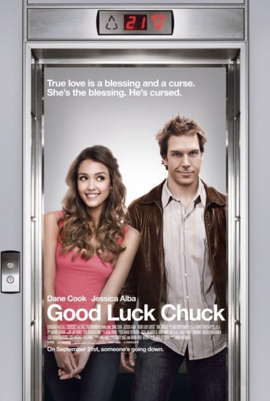
Good Luck Chuck (2007)
Jessica Alba and Dane Cook are supposed to be sharing one cozy image, yet almost nothing about their positioning looks natural. The lighting, proportions and poses make the whole thing feel as though several completely unrelated photographs were assembled into one.
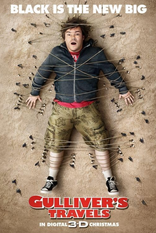
Gulliver’s Travels (2010)
Jack Black’s shocked expression makes sense when tiny people have tied him to the ground. His mouth is another story: look closely and his teeth appear to have vanished entirely, turning a simple reaction shot into a surprisingly strange Photoshop fail.
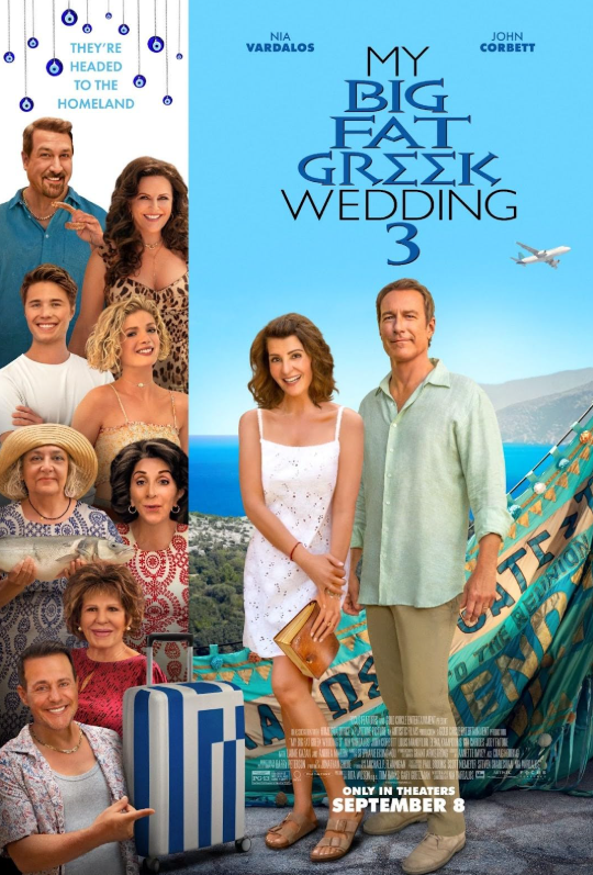
My Big Fat Greek Wedding 3 (2023)
A family portrait should be one of the easiest poster concepts imaginable. Somehow, the aggressively smoothed faces left viewers wondering whether they were looking at the actors or their wax-museum counterparts.
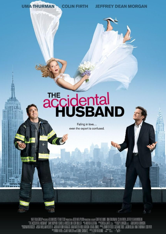
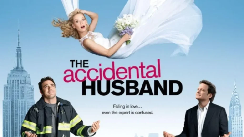
The Accidental Husband (2008)
Uma Thurman is caught between Colin Firth and Jeffrey Dean Morgan, but fitting three people into the same image apparently proved complicated. The actors appear to occupy slightly different planes, turning a simple romantic-comedy setup into an oddly assembled human collage.
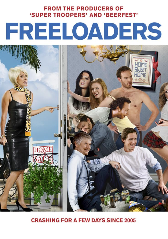
Freeloaders (2012)
There is something strangely artificial about nearly every part of this crowded poster. The cast appears awkwardly pieced together, while even the bucket and crushed cans at the bottom look pasted into a scene that never quite comes together.
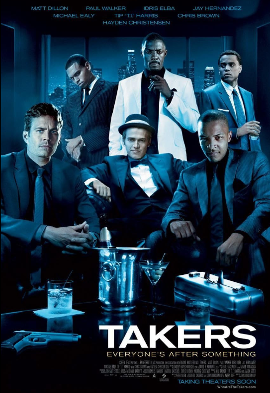
Takers (2010)
This group shot gets stranger with every face you inspect. Several heads look noticeably oversized for their bodies, while wildly inconsistent lighting makes the cast appear to have been photographed in completely different places.